How to build a successful website tip #16: Focus on your customer

The number one thing to remember when preparing to design your company’s website is this: Your opinions don’t matter, only what the customer feels and experiences.


Many business owners design their website to suit their tastes and preferences. Your website is not for you, it’s for your audience. You need to design with your audience in mind, not yourself.

If you build from the customer experience standpoint, you’re far more likely to see success.

Sacha Brant is a business owner who works with peers to help build their businesses from startup to stardom. Sacha knows the importance of starting your business off right and surrounding yourself with the right people. With over 10 years of corporate experience, she’s worked with many entrepreneurs and brands to establish credibility and boost sales. Sacha is into her 3rd year running Sassy Lasses and has recently begun the Empowerment Pride – an online entrepreneurial empowerment group. She looks forward to keeping entrepreneurs and business owners moving forward for years to come. Connect on Facebook, Twitter and Instagram @Deathbysassy

Want more tips like this? Subscribe to our newsletter here

How to build a successful website tip #15: Focus on your forms

If you want to increase conversions and improve the usability of your website, ensure all forms are present at the top of your landing pages and feature a clear, concise call to action. Not only is a short form more likely to be filled out by web visitors, but a clear call to action doesn’t confuse visitors. They know what they are supposed to do, whether it’s filling out the form, calling your business, or clicking on a button to make a purchase. 


This tip was kindly shared with us by Keri Lindenmuth from KDG, a leading provider of web design, custom software development for businesses, and small business IT support for over 17 years. Connect on Twitter: @kyledavidgroup or on Facebook

Want more tips like this? Subscribe to our newsletter here

How to build a successful website tip #14: Simplicity + Optimise

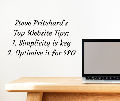
1. Simplicity is key

“There’s a popular saying that true creativity is making the complex simple – this is a saying that you should live by when you’re building a website. User experience is key when it comes to designing a website, if a user finds your website too stressful or complicated to use, they won’t stay around for long, they will leave, and look for something to satisfy their needs elsewhere. Keep your website simple, make it easy to navigate and easy for the user to find what they need.”


2. Optimise it for SEO

“A website is useless if nobody can find or access it. You need to ensure that your website appears on the search results pages of Google when people search for things relevant to your site. Optimise your site for the right keywords, and make sure it is technically sound to ensure that people are able to find it. It may take time before you get it to rank highly, but it is important that people are able to find it, so invest some resources in SEO when building a new site.”

Steve Pritchard is Digital Marketing Consultant at Cuuver.com, a health insurance comparison site. Connect with Cuuver’s on twitter @cuuver

Want more tips like this? Subscribe to our newsletter here

How to build a successful website tip #13: Keep it simple!

The best way to build a great website is to keep one overriding factor in mind: simplicity. 


Everything about your website should make life easier for your visitors. The design should be simple so they don’t get overwhelmed. The navigation should be simple so they don’t get lost. Even your offerings should be simple to make their decision-making process easier. If simplicity is your guiding factor, you’ll make a great website.

Dann Albright is a freelance content strategist and creator specializing in generating demand and leads for B2B SaaS organizations. Learn more about Dann at www.killercopy.pro

Want more tips like this? Subscribe to our newsletter here

How to build a successful website tip #12: Tyler Hanna’s Top 5 Essentials for every website

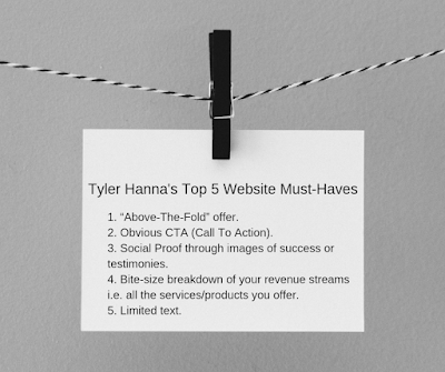
Here are the top five things that Tyler Hanna from creative agency, 8-bit Rex recommends every website have on its home page:

1. There needs to be an offer “Above-The-Fold”. Meaning the website needs to offer something of value to the viewer immediately upon the viewer landing on the home page of the website.

2. There needs to be an obvious CTA (Call To Action). A website viewer needs to know immediately how they can purchase your product/service. For example, “Buy Now” or “Schedule A Free Consult”.


3. There needs to be images of success or testimonies. Social proof is the most powerful marketing tactic that you can leverage. There needs to be someone else besides you to tout your business’ offer.

4. There needs to be a bite-size breakdown of your revenue streams. Further down your home page, customers need to know all the services/products that they can purchase from you. This makes your product/service offerings explicitly clear.

5. There needs to be very few words. Don’t confuse or force customers to read a ton of unnecessary text. Simply let customers know 1. What you offer 2. How it will make their lives better and 3. What they need to do to purchase it.

8-bit Rex is a creative agency in Minneapolis, MN that specializes in digital marketing, branding, and strategy. Combined, the two founders have approximately 15 years of digital marketing, branding, and strategy experience. Connect with 8-bit Rex on Facebook, Twitter and Instagram

Want more tips like this? Subscribe to our newsletter here

How to build a successful website tip #11: Guide visitors around your site and maximise Call to Actions

It’s all about driving visitors to your next piece of helpful content on your site, and guide them towards lead capture. You want your visitors to feel they are obtaining useful information, to a point where they are motivated to speak with you. Several subtle, yet easily accessible Call To Actions on every page are vitally important to encourage them to reach out.


Tim’s company, ISL, recently launched their website, which Tim personally built out all of the content (not design). 


Tim Bailey is a passionate Sports Business Development executive utilizing ISL‘s services in order to market the sports and brands we all love. Connect with Tim here

Want more tips like this? Subscribe to our newsletter here

How to build a successful website tip #10: HTTPS, Hosting, SEO and Design

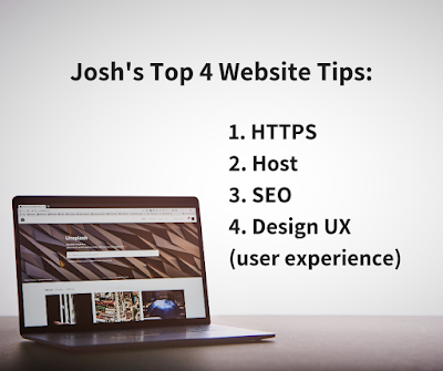
1. HTTPS 
Keep your customers happy and personal data secure.

2. Host 
Think carefully about a web platform e.g. shopify, wix or squarespace. It’s much easier to create something stunning yourself for under $300.00 AUD a year instead of paying an agency $6000 just for a build.


3. SEO
Focus on developing great content, keyword rich pages and building authority and links in your space. These signals all put you in the Google good books. In time, you’ll receive more organic traffic to your site.

4. Design UX (user experience)
Focus on the customer journey, make it easy for them to learn about your brand, purchase products, contact and link out to other relevant branding areas e.g. socials. When you’re building a page actually think – what value is in this for the customer?

Josh is the Director for STLTDFX, a unique collection of limited pieces of art and series streetwear garments, inspired by automotive influences and design. Connect on Instagram @stltdfx. 

Want more tips like this? Subscribe to our newsletter here

How to build a successful website tip #9: Engage your audience with colour

“I am a firm believer in choosing colours that reflect your brand personality. Your website says a lot about who you are and colours are a great way of reflecting this. 


You need to know and understand your audience. Who are they and what are they looking for? Then work around that. Will the colours and themes work for your target market? Are they likely to engage with this content? While we need to focus on our personal brand, we also need to ensure that our audience will like our themes too.” – Caroline Naguib

Caroline Naguib is a designer and PR expert. She is the co-owner of Infomatrix PR, a brand consultancy that helps businesses tell their story.

Caroline studied at the prestigious Enmore Institute and currently design websites, newsletters, merchandise and more for businesses. 

Want more tips like this? Subscribe to our newsletter here

How to build a successful website tip #8: Mobile, video + accessibility

1) Mobile-first strategy – With a majority of online traffic coming from mobiles, its time businesses begin adopting a mobile-first website design that is later optimised for desktop. This will ensure that your site drives results from visitors on their mobile. 
2) Use video content on your website – This can help drive traffic to your landing pages & blogs. Video helps you to engage visitors of your site, increasing the time spent on your page which boosts your Google ranking. 
3) Increase accessibility – Create more ways for visitors to contact you. This includes channels such as email, phone, forms & Facebook messenger. You may also encourage visitors to ask questions, take tours or make consultation bookings in order to nurture those who aren’t ready to purchase.” – Lachlan Hall


Lachlan Hall is a Business development manager for SBP Creative Media, a Melbourne based digital marketing company helping businesses to communicate effectively online. In this role, he assists businesses in finding opportunities to market online and develop strategies that will allow them to cut through the clutter of online content.

Want more tips like this? Subscribe to our newsletter here

How to build a successful website tip #7: PLAN!

“You Definitely should have a plan for your business and eventually your website. Is it going to be your virtual store, Customer service portal or just a glorified Brochure? – I mean a bricks and mortar business without a business plan is pretty silly! Why should it be any different for your website or landing pages? Have a plan for the coming month, 3 months, 6 months, 12 months! Where do you see you and your website 5 years from now? Do you have an exit plan? Do you have a revenue plan? ‘By failing to prepare, you are preparing to fail.’” – Prosper Taruvinga


Livelong Digital helps small businesses to be found when their clients are searching for them. 

Want more tips like this? Subscribe to our newsletter here